


Where Bitcoin could move next, bitcoin price chart analysis is one of the most practical skills you can learn. Price charts don’t just show you “where BTC is now.” They reveal trends, momentum, buyer and seller strength, and the key levels where markets often react. Whether you’re a beginner trying to read candlesticks or an experienced trader tracking moving averages and Fibonacci retracements, chart analysis helps you make decisions based on data, not emotions.
In this guide, you’ll learn how to read Bitcoin charts step by step, how to identify trend direction, how to spot support and resistance zones, and how to use popular indicators like RSI, MACD, and moving averages to confirm your bias. You’ll also learn the most searched, first-page style questions people ask on Google about Bitcoin charts and how to answer them confidently.
Bitcoin Price Chart Analysis Basics (What You’re Really Looking At)
A Bitcoin chart is a visual representation of price over time. Most platforms display the BTC price in candles, where each candle represents a time period such as 1 minute, 15 minutes, 1 hour, 4 hours, 1 day, or 1 week. The goal of bitcoin price chart analysis is to interpret that price structure and decide whether BTC is trending, ranging, or reversing.
At the most basic level, you’re analyzing three things: direction, strength, and location. Direction tells you whether Bitcoin is generally moving up or down. Strength tells you whether the move is powered by strong momentum or weak participation. Location tells you whether the price is near historically important zones where reactions are likely.
Charts become powerful when you stop seeing them as random lines and start reading them as behavior. Every candle is a record of a battle between buyers and sellers. Over time, those battles form patterns, and patterns repeat because traders react similarly to similar conditions.
A reliable workflow begins with higher timeframes first. Daily and weekly charts show major structure and trend. Then you drill down to 4-hour and 1-hour charts to time entries and exits. This top-down approach reduces noise and prevents overtrading.
Bitcoin Price Chart Analysis for Trend Identification
When people search bitcoin price chart analysis, they usually want one thing: trend clarity. The simplest and most effective trend method is market structure. If Bitcoin is printing higher highs and higher lows, it’s in an uptrend. If it’s printing lower highs and lower lows, it’s in a downtrend. If highs and lows are mostly flat, it’s in a range.
A trend is not confirmed by one candle. It’s confirmed by consistent structure over multiple swings. For example, a single breakout above resistance does not automatically mean a new bull trend. You want to see Bitcoin break a key level, hold it as support, and then continue printing higher highs. Trendlines can help, but they are not magic. The market often wicks above and below them. That’s why it’s better to focus on zones rather than one precise line. A trendline is a guide, not a rule.
To validate trend strength, you watch momentum and volume. Strong uptrends tend to have impulsive moves upward and slower pullbacks downward. Weak uptrends often crawl higher with choppy pullbacks that eat time and confidence. On many analysis platforms, traders also monitor a “technicals summary” that combines oscillators and moving averages to indicate buying or selling pressure. Tools like TradingView’s technicals panel are popular for this quick overview.
Support and Resistance in Bitcoin Price Chart Analysis
If there’s one concept that dominates bitcoin price chart analysis, it’s support and resistance. These levels matter because they reflect areas where traders previously made large decisions, such as buying dips or taking profits. Support is an area where price historically stops falling and bounces. Resistance is where price historically stops rising and pulls back. The best levels are not chosen randomly. They are created by repeated reactions, high-volume zones, and breakout or breakdown points.
When Bitcoin breaks above resistance, that resistance often becomes new support. This is one of the most reliable behaviors in trading and is sometimes called a “role reversal.” It doesn’t always happen perfectly, but it’s common enough to base strategies on it. You should also pay attention to psychological levels such as round numbers. Bitcoin often reacts around big figures because traders place orders there.
A practical method is to mark key swing highs and swing lows on the daily chart first. Then refine zones on the 4-hour chart. This keeps you anchored to real market structure, not random micro-level noise. Some market dashboards publish daily pivot points and support/resistance projections. While these should not replace your own chart reading, they can confirm areas the broader market may be watching.
Bitcoin Price Chart Analysis Using Candlestick Patterns
Candlestick patterns help you understand momentum shifts and sentiment changes. You don’t need to memorize dozens of patterns. What matters is recognizing strong rejection and strong continuation. A long wick below price can signal buyers stepping in aggressively, especially if it forms at a support zone. A long wick above can signal selling pressure at resistance. Engulfing candles often show strong momentum reversal when they occur at meaningful levels, not in the middle of nowhere.
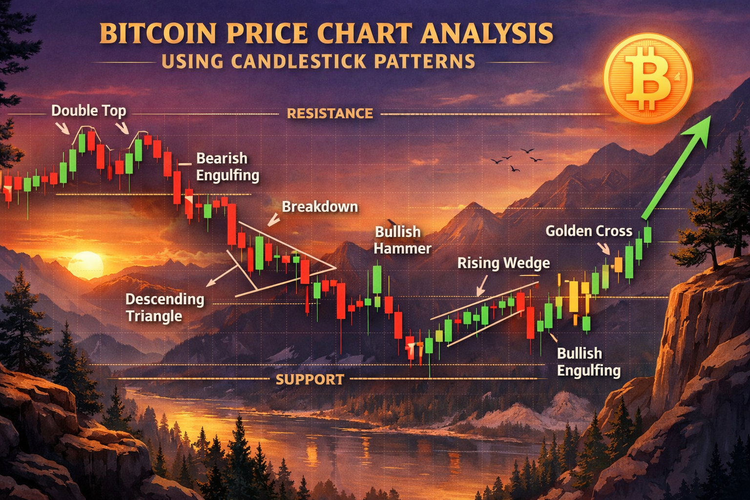
The mistake many beginners make is treating candlestick patterns like guarantees. A hammer candle at random price is just a hammer. A hammer candle at a major support zone, aligned with trend direction and confirmed by RSI divergence, becomes a strong signal. Candlestick analysis works best when combined with context. Context includes trend direction, location near support or resistance, and confirmation from volume or indicators.
Moving Averages for Bitcoin Price Chart Analysis (50 EMA, 200 EMA, and More)
Moving averages are one of the most searched tools in bitcoin price chart analysis because they simplify trend direction. The two most common are the 50-period moving average and the 200-period moving average. When Bitcoin trades above the 200-day moving average, many traders see that as a bullish long-term condition. When it trades below, many see it as bearish. This doesn’t predict the future, but it provides a widely-followed filter that influences behavior.
The 50 moving average often acts like a dynamic support in uptrends and dynamic resistance in downtrends. Price frequently bounces off it during trending moves. If Bitcoin repeatedly fails to reclaim the 50 after losing it, that can suggest the trend is weakening.
A common strategy is to use moving averages for trend filtering and structure for entries. For example, you may decide you only want to take long trades when BTC is above the 200 moving average, then use support zones for entries. You can also observe moving average crossovers, but don’t treat them as immediate buy or sell signals. They often lag. Instead, use crossovers as confirmation after structure shifts.
RSI in Bitcoin Price Chart Analysis (Overbought, Oversold, and Divergence)
RSI is one of the most popular indicators because it translates momentum into a simple scale. On RSI, values above 70 are commonly considered overbought, and values below 30 are commonly considered oversold. But RSI becomes far more valuable when you stop using it as a “buy oversold, sell overbought” tool and start using it as a momentum tracker.
In strong bull trends, RSI can stay above 50 for long periods and bounce near 40–50 during pullbacks. In bear trends, RSI often stays below 50 and fails at 60 during rallies. This behavior helps you recognize the underlying regime.
The most powerful RSI signal for many traders is divergence. A bullish divergence happens when price makes a lower low, but RSI makes a higher low, suggesting bearish momentum is weakening. A bearish divergence is the opposite. Several market technical dashboards publish RSI readings as part of their daily signals. These can help you cross-check your own RSI interpretation and spot extreme momentum conditions.
MACD in Bitcoin Price Chart Analysis (Momentum Shifts and Trend Confirmation)
MACD is another widely-used indicator that focuses on momentum and trend direction. The MACD line crossing above the signal line is often interpreted as bullish momentum, while crossing below is bearish momentum. The histogram shows the distance between them and can help you detect momentum changes earlier.
MACD is especially helpful when you want confirmation that a trend reversal is happening. For example, if Bitcoin breaks above a major resistance, and MACD flips bullish with increasing histogram bars, that can support the breakout thesis.
Just like RSI, MACD is best used with structure. If MACD gives a bullish cross while Bitcoin is stuck below resistance, that’s not enough. But if price reclaims a key level and MACD supports it, you have a stronger signal. Many technical analysis breakdowns highlight MACD as a key confirmation tool alongside RSI and moving averages.
Bollinger Bands, Volatility, and Bitcoin Price Chart Analysis
Bitcoin is a volatility-driven asset. That means volatility tools can be extremely useful. Bollinger Bands expand when volatility increases and contract when volatility decreases. When the bands contract tightly, it often signals a period of low volatility that can lead to a strong breakout. This concept is sometimes described as a volatility squeeze.
When BTC rides the upper band in an uptrend, it often signals strong bullish momentum. When it rides the lower band, bearish momentum is dominant. But again, context matters. A touch of the upper band does not automatically mean “sell.” In strong bull trends, it can mean continuation.
Volatility analysis is valuable because it helps you prepare for market conditions. If volatility is low, you may need patience, smaller targets, or a strategy built for range trading. If volatility expands, you may focus on breakout entries, wider stops, and trend-following.
Fibonacci Retracement in Bitcoin Price Chart Analysis (Finding Key Levels)
Fibonacci retracement is one of the most searched terms related to BTC charting, because it helps traders identify pullback zones. The most watched retracement levels are 0.382, 0.5, and 0.618. In an uptrend, traders often measure the Fibonacci retracement from swing low to swing high, then watch how BTC reacts during pullbacks. A bounce from the 0.618 zone, especially if it aligns with prior support or a moving average, can become a strong confluence entry. In a downtrend, traders use Fibonacci retracement to identify potential resistance zones where rallies may fail.
Fibonacci should not be used alone. It’s most powerful when it aligns with horizontal support/resistance and matches market structure. Many Bitcoin breakdowns reference confluence zones such as horizontal resistance plus the 0.618 retracement as key decision points.
Volume in Bitcoin Price Chart Analysis (The Missing Confirmation)
Volume is the fuel behind price movement. Without volume, breakouts often fail. A healthy breakout typically includes a strong surge in volume as Bitcoin clears resistance. If BTC breaks a major level with weak volume and then quickly falls back, that’s often a sign of a false breakout.
Volume can also help you spot accumulation and distribution. When Bitcoin moves sideways but volume increases, it can mean larger players are building positions. When Bitcoin rises but volume decreases, it can signal weakening demand. Even if you don’t use advanced volume tools, you can improve your chart reading by simply watching whether volume confirms the story price is telling.
Bitcoin Price Chart Analysis Across Timeframes (Daily vs 4H vs 1H)
One of the biggest reasons traders get confused is because they analyze the wrong timeframe for their goals.
If you’re investing, the daily and weekly chart matter most. You care about major trend direction, key support zones, and longer-term moving averages. If you’re swing trading, the 4-hour chart is often the sweet spot for entries, trend continuation patterns, and manageable volatility. If you’re day trading, the 1-hour and 15-minute charts help you time entries, but they also include far more noise.
A smart approach is to decide your trade horizon first, then choose the timeframe that matches it. If you’re holding for weeks, you shouldn’t panic over a 15-minute wick. If you’re day trading, you can’t rely only on weekly structure. Regardless of your style, the daily chart should be your anchor. It prevents tunnel vision and helps you avoid taking trades that fight the higher-timeframe trend.
Bitcoin Price Chart Analysis Strategy (A Simple Step-by-Step Workflow)
A strong workflow helps you stay consistent. Start with the weekly chart and identify major support and resistance zones. Then look at the daily chart and mark the current trend structure. After that, drop down to the 4-hour chart to find your setup and entry area.
At this point, add confirmation tools. Check if BTC is above or below the 200-day moving average. Observe RSI behavior relative to 50. Check MACD momentum direction. Then evaluate volume to confirm whether the move has strength.
When all signals align, you have a high-quality trade idea. When signals conflict, you reduce risk or wait. This is why professional-style bitcoin price chart analysis focuses on confluence. You’re not looking for “one perfect indicator.” You’re stacking evidence.
Common Mistakes in Bitcoin Price Chart Analysis
The most common mistake is overloading your chart. Too many indicators can create analysis paralysis. A clean chart with structure, support/resistance, and one or two confirmation indicators often performs better than a messy chart full of conflicting signals. Another major mistake is ignoring trend context. Traders often buy resistance because they see a “bullish candle,” or sell support because they see a “bearish candle.” Candles are not signals without context.
A third mistake is focusing only on micro timeframes. Many losses come from trading against the higher timeframe trend. If the daily chart is bearish and you’re trying to scalp longs on the 5-minute chart, you’re constantly fighting the bigger market flow. The final mistake is treating indicators as predictors. Indicators summarize past price behavior. They help you assess probabilities, not certainties. That mindset shift alone can dramatically improve your results.
Conclusion
Strong bitcoin price chart analysis is not about predicting the future perfectly. It’s about reading trend direction, identifying key support and resistance zones, and using indicators like RSI, MACD, and moving averages to confirm what price is already telling you. When you combine structure, momentum, volatility, and volume, your decisions become clearer and your risk management becomes smarter.
If you want better entries, fewer emotional trades, and more confidence in your BTC decisions, start practicing bitcoin price chart analysis today on the daily and 4-hour charts. Save this guide, apply the workflow on your charting platform, and revisit it each week as Bitcoin evolves.